Pages

Wednesday, April 29, 2015

050115 Archi-scraps May Challenge

How exciting! Two fabulous scrapbook challenge blogs,

Archi-scraps
C.S.I. Color... Stories... Inspiration
  are teaming up this month!

Here is the Case File we will be solving:
If you've never played along over at CSI, the concept is that all of the 
inspirational elements for your project are contained in the Case File.

The Scene is the visual inspiration for the following elements:

The Scheme - the must-use color palette, plus neutrals (black, white, kraft, cream, gray or brown.)
The Evidence - use two or more for products, techniques or design ideas.
The Testimony - one or more for journaling.

Check HERE for the full details - they are quite specific!

First off I looked through my photos for something that would suit - look what I found!


So girly, and the color scheme will set it off beautifully!


Let's pull some papers, bits & bobs...


I wanted a really dreamy white background but not just plain white.
I recently spied white embossed wood grain on a layout & remembered that I had some.

Unfortunately all of my colored papers, especially the purples, were totally wrong!

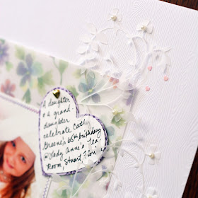
I did find this ancient but lovely vellum watercolored pansy flower paper from
Deja Views which had all of the color scheme in it and continued my dreamy girly vibe.

Then it was just a matter of stitching the photo to the vellum mat,
creating a decorative border.


Next I added some vellum Memory Box Blooming Vine diecuts.
I love these wispy vines & the vellum gives them great body.
I added some tiny pearls on the flower centers for a little texture.


My testimony was done on a punched white cardstock heart,
and tells of this daughter & granddaughter celebrating a 65th birthday.

There are a few more pieces of evidence from Case File #CC-5.


A glittery gold scallop washi edge added to the bottom of the photo.
A tiny gold Theresa Collins heart on the journaling,
 as well as teeny tiny pink hearts from ArtC at the corners.
A tiny Piccolo heart-shaped lock & key represent my architectural element,
hung from the neck of a whimsical wooden bird from Little Yellow Bicycle.


This wasn't as easy as it looks!
Great stretch for creativity in a few different directions
thanks to the detailed parameters in the C.S.I. Case File.

Thanks for stopping by!

Friday, April 24, 2015

042415 CKC April Members Blog Hop


Big fat hop this month!

photo credit
 Can't wait to see what everyone's been up to.

I did all three challenges when they came around this month
but had a couple more pages left in me for these inspirations:

Challenge #2 Sketch Challenge


I went so far afield with my first one that I came back to square one.
This sketch was haunting me!


  (The chevron paper was just begging to be feathers.)
The feathers made me think of cowboys & Indians, hence the "barbed wire" twine, which
was totally inspired by a digi element on a page by our own Master Forger, Angela Coles!
 I did have a hard time finding a pic of the boys that I could crop into a circle, though...


Then I just grabbed a few things to finish off the page.
Still trying to work in the spare, graphic "Messy" style.


Challenge #3 be inspired by Spring


This page is also the April ScrapHappy in-house sketch.

I may kill this kit yet!
Whodathunkit...


Thanks for stopping by!

Thursday, April 23, 2015

042315 WM#166 inspired by Paris

SO happy to get another WM prompt on paper & out of my head :-)

Paris... I visited Paris at the end of a whirlwind tour through Europe when I was 16.
 If I ever visited again it would definitely be as if it was the very first time!
All I can remember is that half of the city looked like any city in the world.
Highrise buildings, one of which was unfortunately our hotel.
Oh - and I ate delicious escargots! (but I didn't want to make a page about snails...)

So I decided to see if I had a French saying in my book. Voila!


I grabbed this Graphic Fairy postcard image & her  
 to make this perfectly Parisian embellishment.


Translation?


And we have plans to do just that this summer - well, a small corner of it, anyway :-)
The map paper I used actually has the area on it, so I highlighted it like this:


So this is my visual depiction of the quote


with a copy of our travel brochure tucked behind!


The binocular lady was also The Graphics Fairy.
I added the popped up hemispheres from The Vintage Moth.

This was a ton of fun to make!


Thanks for stopping by!

Tuesday, April 21, 2015

042115 CKC Scrap Crush REVEAL!

 
Here is my Scrap Crush page.


I wonder how many of you guessed that my crush is...

SoapHOUSEmama aka ASHLI OLIVER!
her blogpost HERE
 Ashli is currently on the Design Teams at
Cocoa Daisy, A Flair for Buttons, the Simon Says Stamp Monday Challenge blog & CATfile store.

A gallery of her work can be found HERE.
Her YouTube channel is HERE.
Her Pinterest board of her work for Cocoa Daisy is HERE.

Here is a compilation of some of my faves:


 Stitching, stamping, fussycutting, grids, flair, scraps, 
stitched alphas, watercoloring, small pieces,  gesso over alphas, 
stencil w/paste, doodling, layered papers under photo as a mat...

Such a freestyle approach with a generous splash of artsy.

I decided to use this one as my inspiration & did a fairly literal scraplift.
her process video HERE
She does wonderful process videos that take all the mystery out of
how she makes her decisions for the page & the various techniques.

I have to say as well that she has an adorable little family.
She is very relatable in many ways & seems genuine & unpretentious.

I mean, this woman doesn't even own a paper trimmer!
Why do I think I need the perfectly-sized circle punch
when I can just grab my scissors & CUT. ONE. OUT.
(...and this comes from the Queen of Fussy-Cutting, lol!)

I hope I have made YOU fall in scrappy love (maybe just a little?) with this talented artist.
Comment below to let me know if you guessed right!

Thanks for stopping by!

Monday, April 20, 2015

042015 CKC Scrap Crush Challenge Hop

Extra fun this month at the Counterfeit Kit Challenge blog!


Every once in awhile our team of Master Forgers
gets a little insider challenge going,
courtesy of our own Lisa Hausmann.

This time we need YOU to play detective & solve a mystery!


Each of the participants has agreed to be inspired by our "Scrap Crush" - someone who always wows us & whose style is exceptional - and has made a counterfeit page based on that person!
 

My crush has a very artsy, whimsical, light & airy vibe to her work.
I suppose the theory that "opposites attract" is at work here!

Here is my attempt to incorporate her style with my own.

 
I took a few tips & tricks from my crush.

I loved layering up a stack of papers for my photo mat. 
I tried to gather a limited amount of supplies with color in mind more than anything else. 
When it came time to start making decisions I didn't second guess - just played a little & committed. My page is also a scraplift so the influences are more obvious when you see the two together.

  Some other things I want to try in future are toning down some of the patterned papers with white paint & sewing on my title letters - why don't I do that more often? I've always loved how it looks.


Tomorrow there will be a CKC post to reveal who the crushes were.

I will also share a little gallery of favorite projects she has done, so be sure to come back tomorrow!

DON'T FORGET to leave your guess as to who it might be in the comments below.

GO HERE NOW: Lisa:  http://lisahausmann.blogspot.ca

 
Thanks for stopping by!

Thursday, April 16, 2015

041615 CKC April Challenge #3

And the inspiration just keeps coming over at the Counterfeit Kit Challenge blog!

April Challenge #3 Spring Inspired: 
Let Spring help inspire your project

Living in a state at the top border of the U.S. makes me delight
in those first signs of life after the blanket of Winter begins to recede...

This moodboard at S.W.A.T. Challenge #53 was a great inspiration!


I began with the Messy thought of mimicking a pocket page with a grid.
I chose some elements & dressed them up with some vellum & stitching,
then made a simple title block with plans to add a little strategic stamping.


As I began to add the photos there was still a lot of empty white space.
Mounting the page on a grey & white polka dot helped add a border, an idea I got
from Susan's page HERE, but there was still an especially large space at the top... ugh.
I tried adding some stitching but it looked dreadful & now I had a row of holes!


I thought perhaps adding some washi, but couldn't get that to work either.
Eventually I cut strips of the script card from my kit to work in here & there.
I added some polka dot washi tape to them as an accent, covering the top corner with it.
Getting happier! Finally fussy-cut a little bee for that corner & it's done.


I also added some flowers made from the vellum circles & brads,
just like the ones made by Elsie at A Beautiful Mess!


One last change was mounting my title on a photo overlay with a big heart,
another subtle layer that adds the perfect sentiment about Spring.
It also gave me something to attach the title letters to with a tiny attacher!


I think I'm drifting further & further from the messy vibe!

Go ahead - celebrate Spring with a page from your counterfeit kit 
& a little Spring mood from S.W.A.T. Challenge's gorgeous inspiration board :-)

Thanks for stopping by!