Challenge
#3: One side or the other
Focus on only ONE side of your project
(either one...I don't have a preference)
and keep the rest white space.
Fortunately I had some help from ScrapHappy's June sketch.
Link HERE to find out more about membership.
More inspiration from my scrap crush, Ashli Oliver.
I loved the stacked elements on the left & the layers of white.
 |
| Ashli Oliver for Simon Says Stamps |
(Process video HERE)
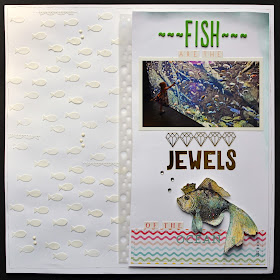
We just spent a week visiting Gatlinburg, Tennessee en route to Atlanta to see "the peaches."
We went to the Georgia Aquarium to celebrate their birthdays.
Chloe adored being up close & personal with the fishies!
She struck a pose more than once of gracefully moving as if she was swimming...
I knew I wanted to use this fish stamp, so I used a less than perfect image
to hold it's place on the start of my layout. The blue paper is standing in for the photo.
Then I used Archival Ink for a perfect image, and added an assortment of Distress Inks to add color.
This process always seems miraculous!
Just blot the ink pads on your mat, spritz with water, and sop up the ink.
Then I added a subtle spray of gold Color Shine.
Fussy cut, highlighted the crown with a gold pen, added a few tiny gems, and some Glossy Accents for the eye.
Makes me look like an artistic genius but the Ranger products did most of the work!
Because of the direction of the fish stamp I flipped the orientation R-L.
Then I decided that my white space could use some added pizzazz.
 |
| Happy Scatter Etsy shop HERE |
(It was really hard not to add any color on the left.)
A little vellum accent punched with "bubbles" is the perfect finishing touch.
 | |
| Thanks for stopping by! |


That fish is completely amazing! The last close-up really shows off the shimmer and shine - fabulous job! There's so much else to love too - the vellum bubbles, the clever title, the rainbow patterned paper, the modeling paste fish (I just got a stencil and some paste and am going to try that soon) and that sweet photo. I just love this one Leslie!
ReplyDeleteWow that is so cool! I love what you did with the fish stencil omgosh that is so cute! Beautiful layout it is :)
ReplyDeleteThis is so charming. Love the little bit of stitching - a lot.
ReplyDeleteyou did an amazing job of adding all those elements and features into your page and yet it's still clean and clear and full of white space! Fabulous. My favourite bit is the bubbles vellum :-)
ReplyDeleteI love your stencil work here!! This layout compliments the photos beautifully!
ReplyDeleteWha a sweet layout. Love the fish stencil and the distressed fish.
ReplyDeleteCindy F