Tuesday, March 31, 2015

040115 Archi-scraps April Challenge

There are really no end of intriguing architectural photographs in the world!

Challenge: Use something on your layout at an unusual angle.
This was a stumper for a good while.
I decided to go looking for some photos that might include a similar color scheme.

Meet Fred


Journaling:


I have been having fun lately adding random stamping to my pages.
This time I added some appropriate rub-ons, too!


It's amazing what you find in all the things you've been collecting when you actually have a good rummage through. This page became quite whimsical & I love it. That makes a fun story even more entertaining. I gave Fred a little stamped crown (and wouldn't you know I found a better one in my rub-ons but too late) and the "awesome" element & "wassup" word just seemed perfect.


I mean, what else would you say - seeing the world for the first time?

Thanks for stopping by!

Monday, March 16, 2015

031615 CKC March Challenge #3

March's Counterfeit Kit Challenge #3 was an interesting one, to say the least!

Challenge #3 On Your Desk...

This challenge should have been called, "True Confessions"! 
Take a look at your desk RIGHT NOW.
Messy? Pile it on, ink it up, layer it on.
Neat & tidy? Go for the minimalist approach.

Here was my desk:


Surprisingly the only thing in disorder are the wood veneer pieces to the left,
but I wouldn't by any stretch be inspired to minimalism by this desk!

So - off to troll the Magic Blue Box for whatever will help tell 
my story in a way that might be dubbed organized clutter ;~)

This past Saturday was Pi Day - the only time this entire century 
that represents the numerals in the mathematical value of Pi.
We took this great photo to commemorate the event.

I grabbed that striped washi from my stash to create some borders 
a la another Master Forger - Lynnette's Challenge #2 layout see HERE.
 
 The pie chart paper play on words as part of the matting was irresistible!
I used the wood veneer frame to highlight the exact moment on the clock.


The #1 tab reinforces the once in a lifetime aspect of Pi Day.
The tiny circle Capture/Document stamp was added to fill up that little space.

You might think that the flair on the camera lens should say Math instead 
of Science but as I know from my scientist hubby the two are inseparable.


Continuing the circle theme I added the globe with a little 
banner element pointing at Michigan to mark where we were at the time. 

The punched circles on the top photo mat were total serendipity, a leftover scrap found 
tucked in with the 6x6" paper pad that I used for some of the accent papers.


As I've mentioned lately I am dressing up my pages a little by using 
some subtle stamping to give it some little finishing touches.

The wooden arrow was printed on the journaling card, 
but I added a tiny arrow with a "this is:" sentiment &
below that "Highlight #Hooray" accented with an enamel dot.
The MME flair pin got dressed up with a little ribbon.


Please join us in this innovative inspiration from CKC!
 
Thanks for stopping by!

Sunday, March 15, 2015

031515 Whimsical Musings Challenge #160

How I am enjoying seeing snippets of Lisa's February trip to NYC!
Inspiration #160 was based on this gorgeous Fifth Avenue shop window:


Serendipity again provided a start to my page.


Just the day before this posted I ran across this scrap of fabric.
Circles? Let's try this:


I loved the gold accents, so I punched some circles for accents out of gold metallic paper. 
I chose a Heidi Swapp gold glitter sentiment & a Jolee's bling gold sequined bow (see final pic.)
I discovered that some punched white circles would disguise the blank spaces between the circles.
Later I added a few metallic gold large enamel dots to fill in those spaces.

 Okay, so I got started...but something didn't look right.

I noticed a little detail in the inspiration.
The pattern in those circles are arranged to make a burst of color!


So I made a template from kraft paper & grabbed a few mists...
a bonus was the oversprayed paper underneath - four sheets of new custom paper.
They were a little less than subtle, especially next to the raw wood.
I used some white Distress Stain to tone it down & blend the color to soften the edges.


The final element from the inspiration was the feathery outfit so peacock pics are perfect.
I added a little gold paint pen to the edge of the paper to finish it off.


Have fun with this one!
Don't forget to post on the Flickr gallery tagged WM#160


Thanks for stopping by!


Thursday, March 12, 2015

031215 CKC March Challenge #2

Another challenge for Counterfeit Kit Challenge blog!

Challenge #2 Irish Challenge

I have had the pleasure & privilege to visit Ireland.
What a beautiful place, with rhododendron hedges that must have been twenty feet tall.
What we remember most fondly, though, is how friendly the people were.

Putting together this challenge page was a lot of fun!


I never confine myself solely to the contents of my kit,
just as I wouldn't if it was one I received in the mail.
I mean, I have shamrock washi! Couldn't pass that up :)


 And this little lephrechaun is on his way to me in my
Jenni Bowlin March Magpie Box as we speak.
I just used a digital stand in...


 Here is the story:


The Bazzill Basics Wayfarer "Excursionist" paper was a FAB cheater paper for this page.
All that banner work was done for me.


My take on this challenge was pretty literal, but you can probably find a much more creative way to interpret this challenge. Make sure to post your creation on the Monthly LinkUp tab at CKC!

Thanks for stopping by!


Friday, March 6, 2015

030615 CKC March Challenge #1

It's the 6th and time for the first challenge from Counterfeit Kit Challenge blog!

Challenge #1: Border Craze:  Use dies cuts, stickers, gems, stamps 
to create a border around your page!  Get creative!

I was a little afraid of this one =8~O
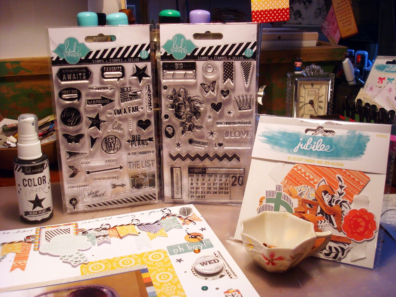
I decided to use the MME Jubilee Tangerine Mixed Bag of embellis.


Got this far but something was definitely not working so hot...
and everything but the shield, photo & mat were stuck down!

I pulled these goodies from my kit in the hopes of perking things up.


All along I had known that the Color Shine schmutz application 
would make all that white background behave. 
What I needed was a way to get the border to LOOK like a border!


Here is a close-up of those Heidi Swapp stamps. 
I keep these out on my desk to add that "little something". 
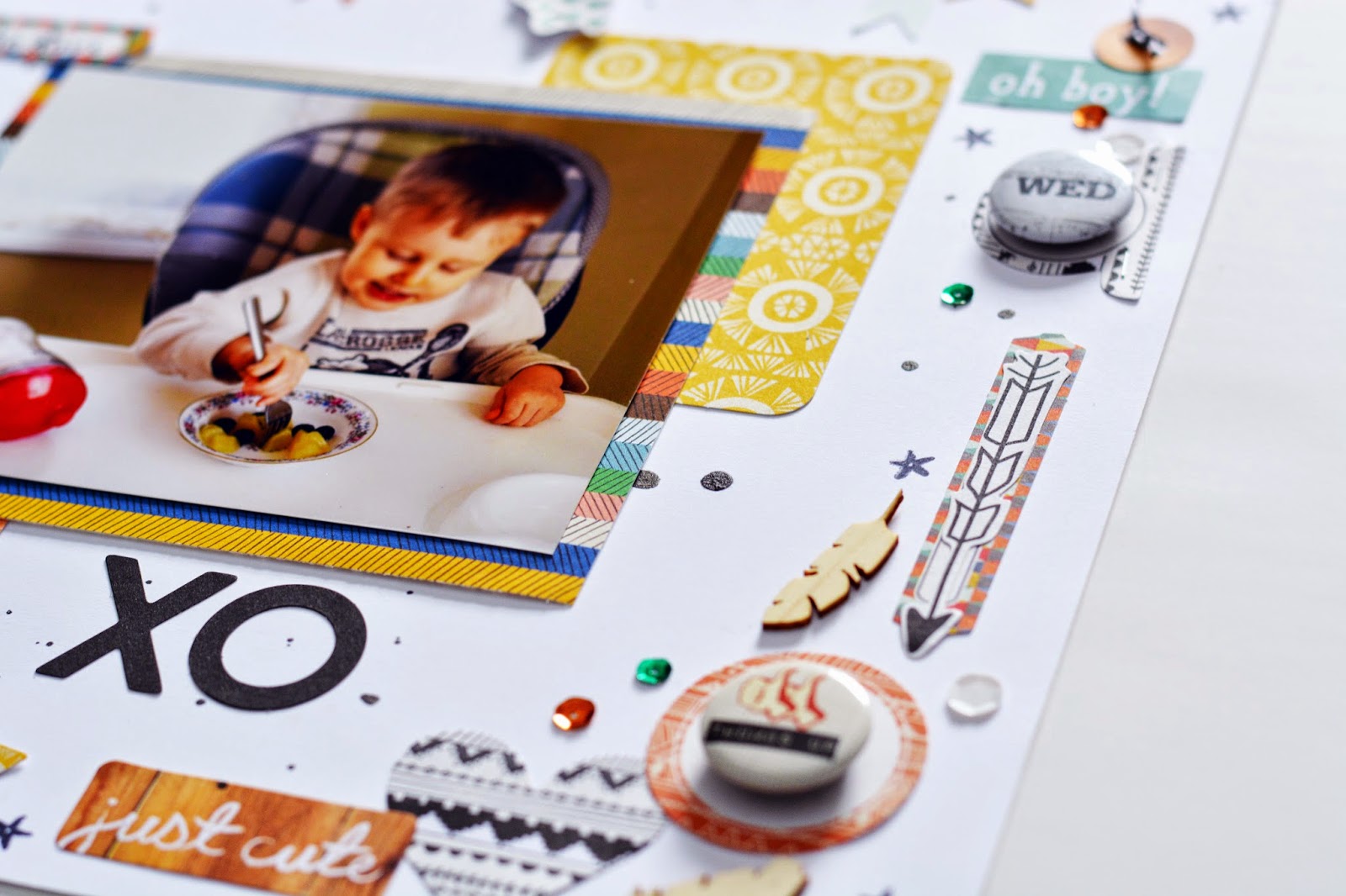
I love the extra detailing that stamping adds & it definitely helped save this page.


This piece in the banner stood out like a sore thumb until I added the tiny sentiment heart.


Even this star sequin stamp perked up my border.
 I changed out the floral elements for flair, added some twine to the banner,
a little journaling across the top & some Jubilee Project Life-style cards 
underneath the photo mat. It's all quite busy but that's how it feels with 
the boys here, so I'll pretend I did that on purpose!


Hope to see your own creation for Challenge #1 at CKC.

Thanks for stopping by!


Wednesday, March 4, 2015

030415 CKC March Tutorial

Well, this month I only had a few simple forgeries.

It's always worth sharing, though, as counterfeiting is not a mystical magical skill!
It's usually just seeing an element of the kit & thinking - 
Hey! I have those (such-and-such) that I could (do such-and-such to) and it would look just like that.

Like this sheet of kraft frames from Jillibean Soup...


I want them to look like these in the kit, also from Jillibean Soup.
(hmm... hadn't realized that until this post...)


Voila! a simple woodgrain stamp transforms those plain-Jane frames.


Now I have squirreled away this little roll of cork for many years.
(I think the only time I have used it is for forgeries, lol!)


I simply cut a strip the same width as the ruler to make it easy.
Cut two pieces, cut the corners & punched the hole.

These cork tags from the custom items in the kit are what I'm trying for.


But I'm wanting something a little more interesting.


A little stitching makes them MINE!
Fair warning, though. Cork IS tough, but be careful close to the edge.

Now take a look at this month's inspiration kit shown here:


and choose a favorite element to forge!

And don't forget to post your creations to the Monthly Link-Up tab on the CKC blog.

Thanks for stopping by!


Sunday, March 1, 2015

030115 CKC March kit reveal

Wow, is this year just flying by already?

Here we are at the Counterfeit Kit Challenge blog with another FAB kit to forge,
and welcoming another wonderful Guest Designer, Janine Rachau!
Janine has been playing along with us for awhile now & is a prolific & inspiring scrapper.


The base of the kit is the MME 6x6" Jubilee "Tangerine" paper pad.
This is my worksheet using the original for hunting/gathering my papers,
my usual staring point for creating my kit each month.


But I was uninspired... :-(
Thankfully, I discovered these Jubilee products in my stash:


Let's take a look inside the Magic Blue Box, shall we,
at my Rogue Gourmet Cake Kit?
A little nod to our kit producer, A Piece of Cake Designs!

Link HERE for the Rogue Gourmet's cake recipe!
First I pulled some realistic black & white papers.
I added the balloon motif, wood, & arrows in a nod to the original.
Grabbed a selection of 6x6" pads that tied to the color scheme.
I am determined to bust a lot of my 6x6" stash this year!


Then some bits & bobs. The wood veneers instead of the stickers, gelatos,
some bling to go with the sequins, a big fat tied-up-with-ribbon
stack of flair, and a few of Shimelle's stickers for good luck.


And here you have it! My Rogue Gourmet Cake kit.


(Pssst...anyone notice the clover playing cards? It is March, after all - wink wink!)

I never tire of putting together a forgery of the monthly Counterfeit Kit at CKC.
 My best tip for creating a counterfeit kit?
GO ROGUE!

 Make it your own - one that you will use. I frequently deviate from
the inspiration with the color scheme or overall feel of my kit.   I almost
always begin with the papers and attempt to stay true to the mix of pattern types.
All of the other bits & bobs just need to play along nicely :-)

A lot of the current trendy products are a little too geometric or graphic for me.
That said, it IS good to get out of your comfort zone a little & play with the trends...

Here's the hop. Make sure that we get to see what kit YOU put together
& scrap with this month by posting your kit & pages at the CKC blog Monthly Link!
Guest Designer Janine:  http://rachauscratchpad.blogspot.com

Julene:  http://julenebydesign.blogspot.com
YOU ARE HERE: Leslie:  http://lcsmithsaved-outofthemire.blogspot.ca
GO HERE NEXT: Lisa:  http://lisahausmann.blogspot.ca

Thanks for stopping by :-)