I have finally given myself liberty to scrap some of what has been lurking on my desk. I have been having printer woes for awhile (and unfortunately it's not over yet) & have created a bit of a backlog of ideas in the queue while waiting on the photos.
This page is about our last minute decision to travel this past summer to the totality zone of the
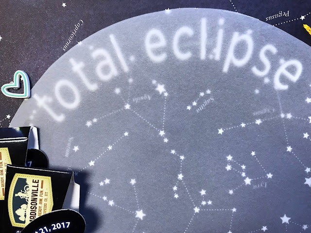
Okay. I DO know that this was a solar eclipse, in spite of the starry
night sky background paper. It really helps represent the most dramatic
effect of totality - it got dark! I like how it supports the dark
photos.
Isn't this pocket card perfection? Perfect sentiment & it gave me that third aqua color for an accent. And hey - it made a perfect pocket! Now I can find those glasses at the next eclipse, hehe, and I love that they were printed with the date & location. The flair matched perfectly.
The next perfect piece? The Pink Fresh Studio/Indigo Hills wood clip that screamed eclipse to me. Lining it up with the vellum circle confirmed it. The stitching truly mimics what it looked like just after totality with the sunlight bursting forth again. It also gave me a subtle way to anchor the vellum.
I used that adorable aqua Felicity Jane rubber heart to draw attention to the title. I mounted the FJ alphas under the vellum & I love how it looks. The rest of the title is at the bottom of the circle - a play on an old song title. The last perfect element!
He's such a dear, darling man! <3
I had fun using my vintage typewriter for the journaling elements.
 |
| Thanks for stopping by! |


I adore this page! Your stitching on the sun is wonderful and you are correct in saying those darker papers suit your photos. Fantastic.
ReplyDeleteOh, this is a beautiful layout! That hand stitching is just amazing!
ReplyDelete