Such a stunning photo this month at Archi-scraps!
The challenge this month is clocks & for me this fab photo's color scheme.
And this will be a twofer including Whimsical Musings Challenge #188, clocks!
I had the perfect sky paper from Creative Impressions - one so old it isn't even printed on cardstock.
I chose this Anna Griffin paper to pick up the pop of red & to just peek out as a scant border.
Unexpected but picking up the vintage vibe I want for this page.
Then I found this Graphics Fairy image with an hourglass!
I changed it to b/w & painstakingly fussy-cut it to begin my title.
Then I dove into my CKC February kit.
Basic Gray Wholy Cow alpha rub-ons look custom made for my title block!
Another rub-on & a stamped birdie finished the title.
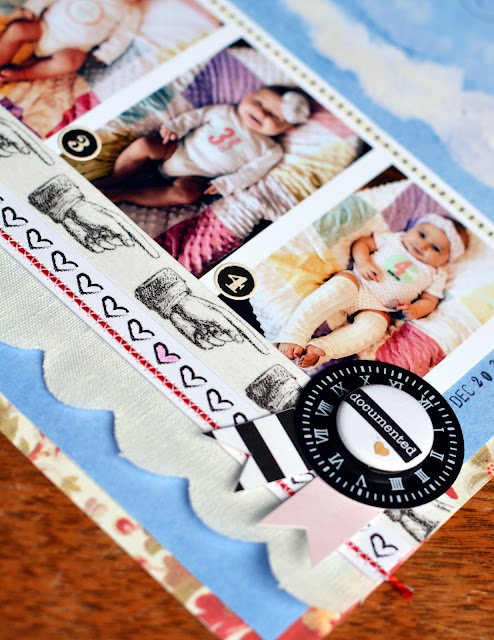
These monthly photos of my granddaugher from 0 to 4 months provided the subject.
I dressed them up with one of the Felicity Jane branding strips, connected to
some Heidi Swapp scalloped fabric trim with red floss, some vintage pointing hand washi,
and a tiny strip of quilting tape at the top (I know! perfect touch) of the photo strip.
I finished it off with this cute little rosette mounted on a clock face!
The last and most perfect detail was using one of my custom arrows from my kit.
I even found a clock spring when rummaging for that little clock charm - so perfect to
show the trajectory of the arrow & tie in with the swirls & swoops in the title alphas.
Here's the full page reveal:
Now try your luck at being inspired by that amazing photo!
Make sure to link up before month's end.


This is wonderful - so many perfect details that I'm not sure which I like best! The arrow with the clock charm and spring is just divine...you have a fabulous ability to add bits and pieces that support your theme and story so well. This page is such a treasure hunt for the eyes (and your granddaughter is adorable too).
ReplyDeleteWhere to begin! Wow - just wow! I love all the detail you have here. Of course, I really love the fussy cutting - I love it when I take the time to do this and your cutting looks amazing. And using the rub ons looks great. OF course, the row of gorgeous baby photos is fabulous - love these type of layouts and the clocks/clock details? Perfection! Love the double challenge combination and love that you did this for WM too!
ReplyDelete